
Platform Navigation System
to unify the user experience across several products
Problem
In the early months of 2022, Panorama Education embarked on a journey toward transformation, focusing on adopting a platform-first approach and consolidating all the products into a one tool. The objective of this strategic shift was to provide a comprehensive and all-encompassing solution that caters to the unique needs of student service teams.
This change required a complete overhaul of our navigation system and a shift in mindset toward maintaining consistency across products. We made several changes to our information architecture, introduced new global, primary, and secondary navigation, and updated our visual design to align with our new approach.

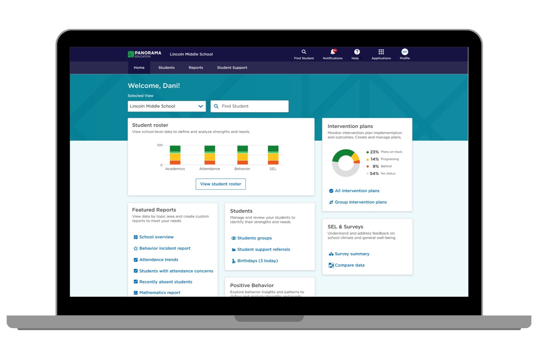
A few screens from Panorama before the project
Why this initiative?
User feedback:
Numerous low NPS scores highlight navigation-related concerns.
Usability issues were flagged as a reason for churning customers.
Demo and training challenges: The platform's complexity made it incredibly challenging to demo effectively and even more difficult to train customers on its usage.
Inconsistencies in navigation patterns within individual products and when transitioning between them.
Product growth: The existing patterns made it difficult to accommodate new functionality and features. The teams constantly struggled to figure out where to put new stuff.

Analytics and Replays analysis
Navigation design strategy: Consistency and best practices
Five essential components aim to ensure consistency and implement the best practices of usability and accessibility.
1) Global navigation: Ever-present container housing menus and utilities accessible from any location within the platform. A persistent, uniform presence throughout the system maintains user familiarity.
2) Primary navigation: Ever-present container housing menus accessible from any location within Panorama's platform. It contains our primary product areas.
3) Secondary navigation: Offers enhanced granularity within a specific topic item. Sub-navigation links send users to other pages, and they maintain a flat hierarchy.

4) Landing page: Tailored per user role with accelerated flows.

5) Defined page structure: Page headers, defined page titles, defined filters/view by sections, breadcrumbs, action buttons, and back buttons.

Information architecture approach: Categorization based on JTBD and the user journey
We decided to take a workflow approach to categorization and organize based on the activities and tasks performed by educators instead of the previous product-based categorization. By doing so, we focus on the jobs that need to be done rather than how we are organized internally or how the products are sold.
How did we come up with this IA?
Card sorting (open/hybrid)
Many rounds of usability testing
Feedback sessions with CX and the revenue team
Pressure testing the IA

General structure (doesn’t include subpages) - all products under the same platform
Launch and delivery
Release #1 - Live platform walkthrough
Release #2 - Prototype walkthrough
Outcomes

UX-Lite Overall Score was higher than 61% of all products tested
UX Lite
V1 Launch UX-Lite scores were very in the medium-high range, with Ease ranking in the 77% percentile and Usefulness ranking in the 35% percentile.
The UX-Lite SUS estimate was 80.0 (with a 90% confidence that the population score lies between 74.1 and 85.9), equating to a grade of A- and excellent acceptability (and right at our aspirational target)
These scores represent significant improvements over the baseline scores—the best we’ve seen to date—and strongly suggest that the new nav system is a substantial improvement in the overall user experience.

Home Page/Nav post-launch analytics
Feature discovery
10% increase in page views/visitors YoY
Valuable pages such as Student profiles, Intervention Plans list, Intervention Plan creation, Attendance Report, and Behavior Report saw a 50+% increase in page views YoY (vs. 20% increase in visitors)

Feedback sessions
Qualitative feedback
From the revenue team: This has made leading demos and training easier because I can ground a specific user group on their home page and can clearly say, "This is designed for you; the district page is designed for the things that matter to you.”
From school admins:
“Overall, the new design has been super exciting! I feel like it is much more user-friendly (especially for newer users who might have been intimidated previously). “
“I barely get any questions about where to find interventions anymore”
From educators:
“The new homepage structure is a much better landing page for the platform. It’s not as scary”
“Everything I need is right there.”
“I love that Panorama is simple! It is easy to use, and I love it”